Tattoo
Gigibossu
View profile
3.8
/ 5.0
★★★★★
★★★★★
Bold Blackwork Sleeve
"Storm clouds and serpent scales converge in a dramatic monochrome dance of east meets ink."
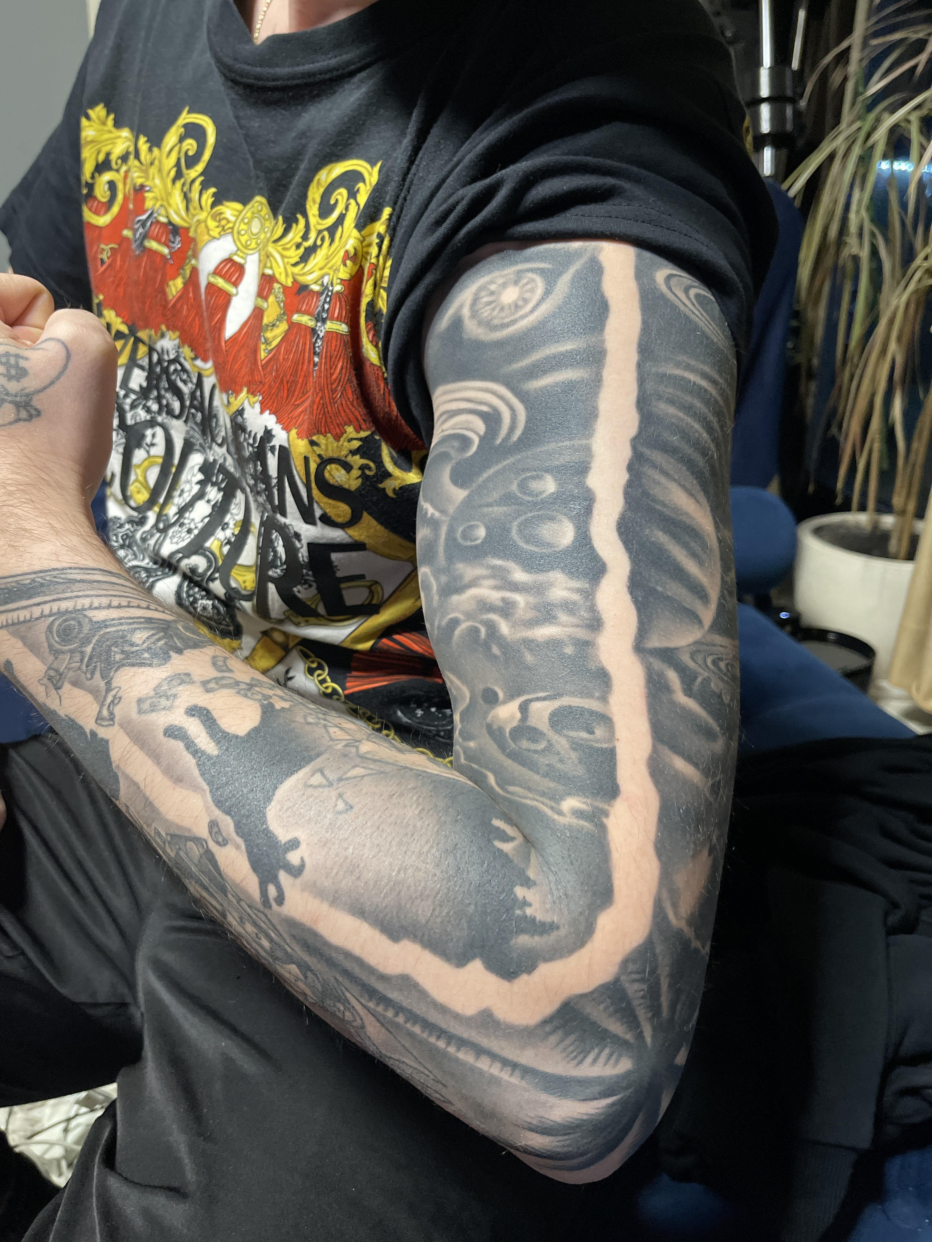
Dramatic Black and Grey Asian-Inspired Full Sleeve Coverage
Breakdown
-
Line Work7/10The wave patterns and scale details show clean, confident linework with consistent weight throughout the sleeve.
-
Shading & Fill8/10The solid black packing is dense and even, with smooth gradients where the dark grey meets skin tone.
-
Design & Creativity7/10Traditional Japanese-style elements are well-composed with effective use of negative space creating visual flow around the arm.
-
Placement8/10The sleeve wraps naturally around the arm's contours, with elements positioned to follow muscle structure and movement.
-
Execution8/10Technically proficient with consistent saturation, though some areas show slight healing or settlement variations in the black.
How to push it higher
- 1 Consider adding small highlight details or white ink accents in the wave crests to enhance dimensionality and visual pop
- 2 The dragon scales on the upper arm could benefit from slightly more defined edge work to separate individual scales more distinctly
- 3 Adding subtle texture variation within the solid black cloud areas would create more depth without compromising the bold aesthetic
Trends
Japanese-Style
Blackwork-Sleeve
Negative-Space

Free plan includes watermark
Remove — from $3.99/mo
Deep Analysis
# DETAILED REVIEW
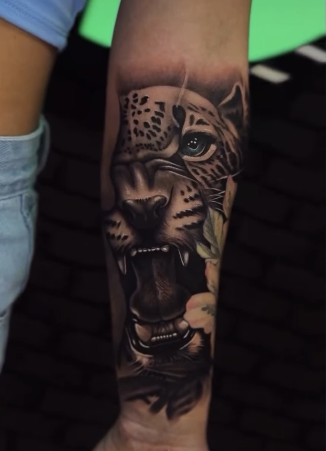
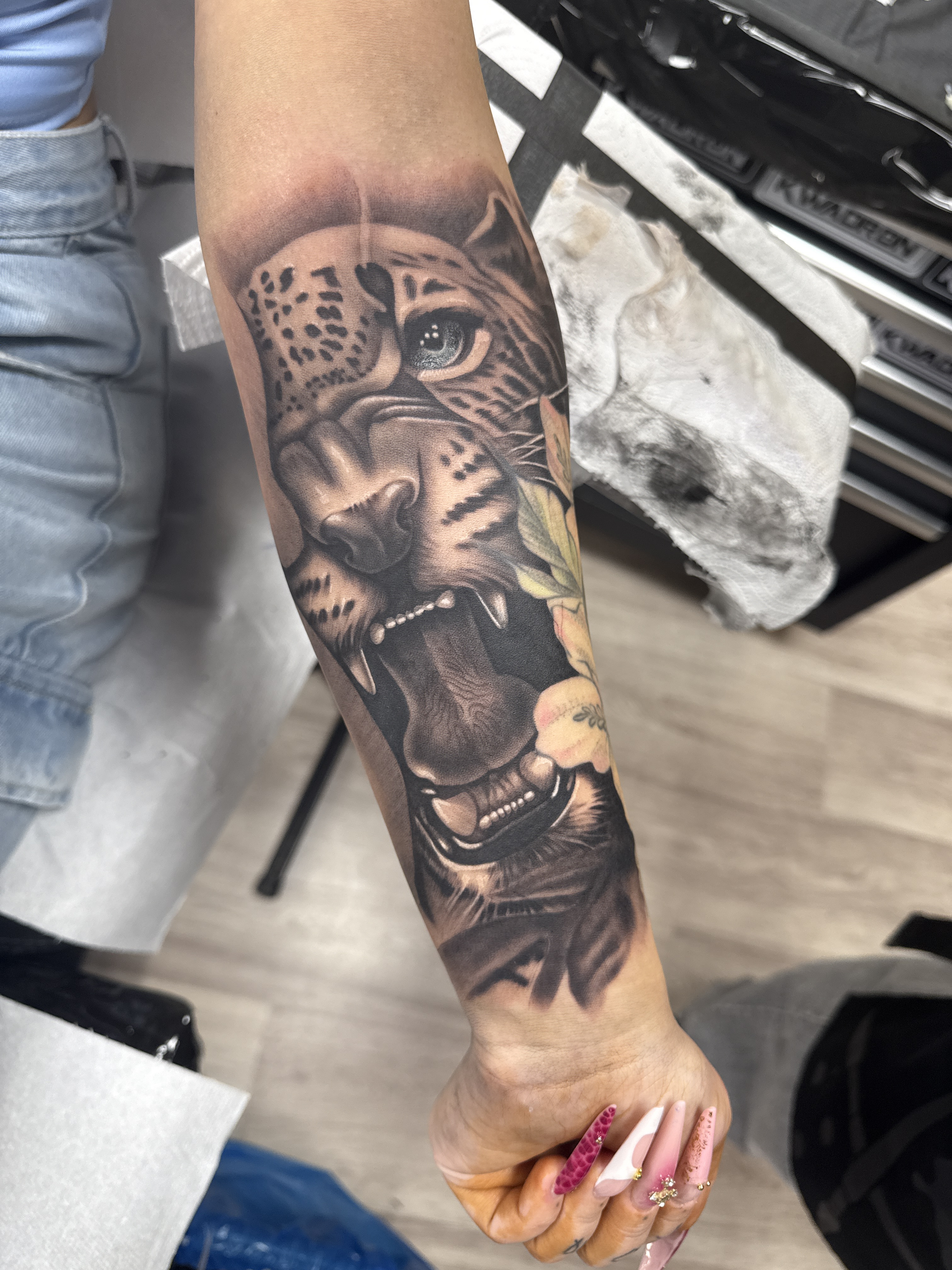
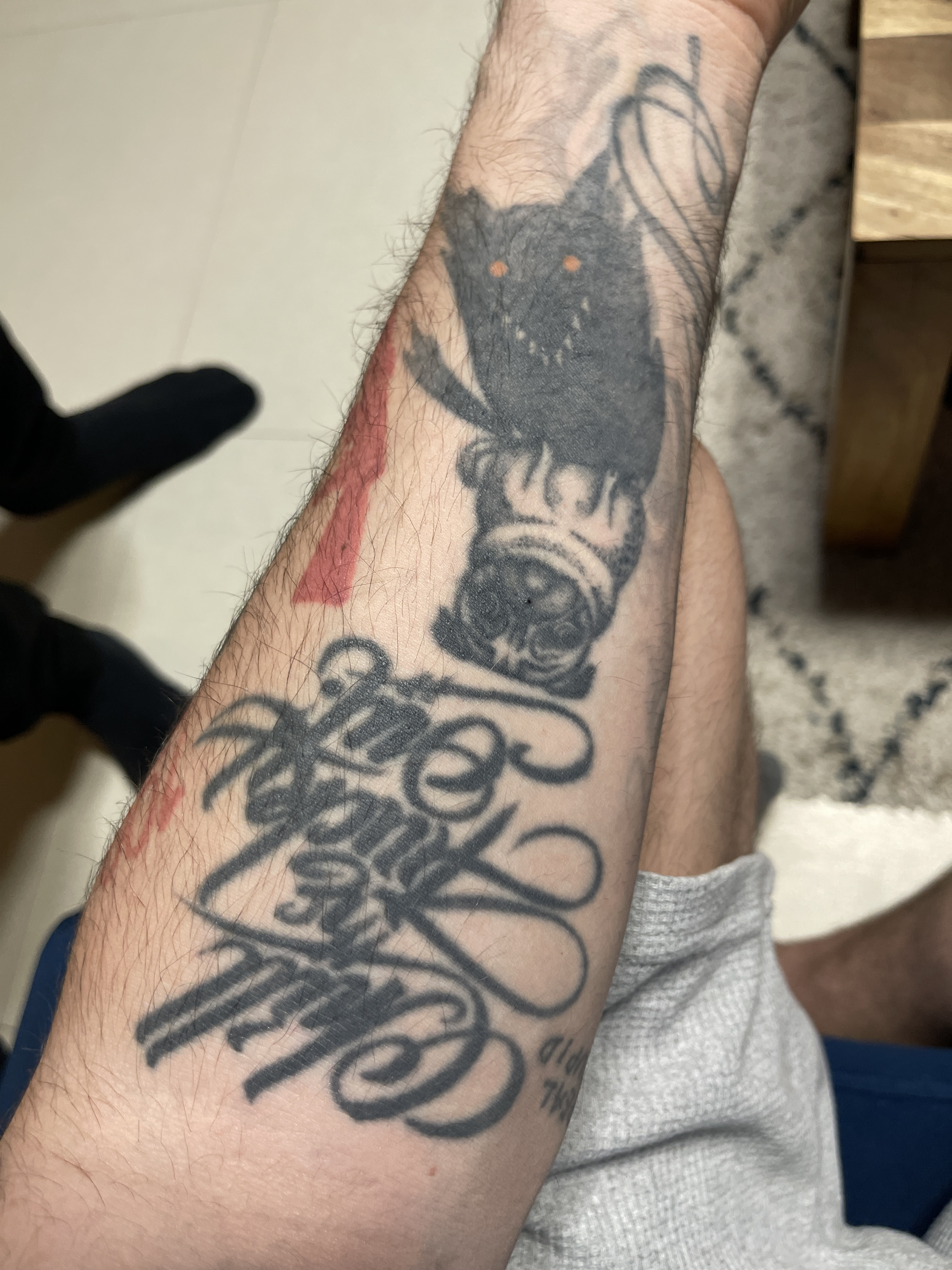
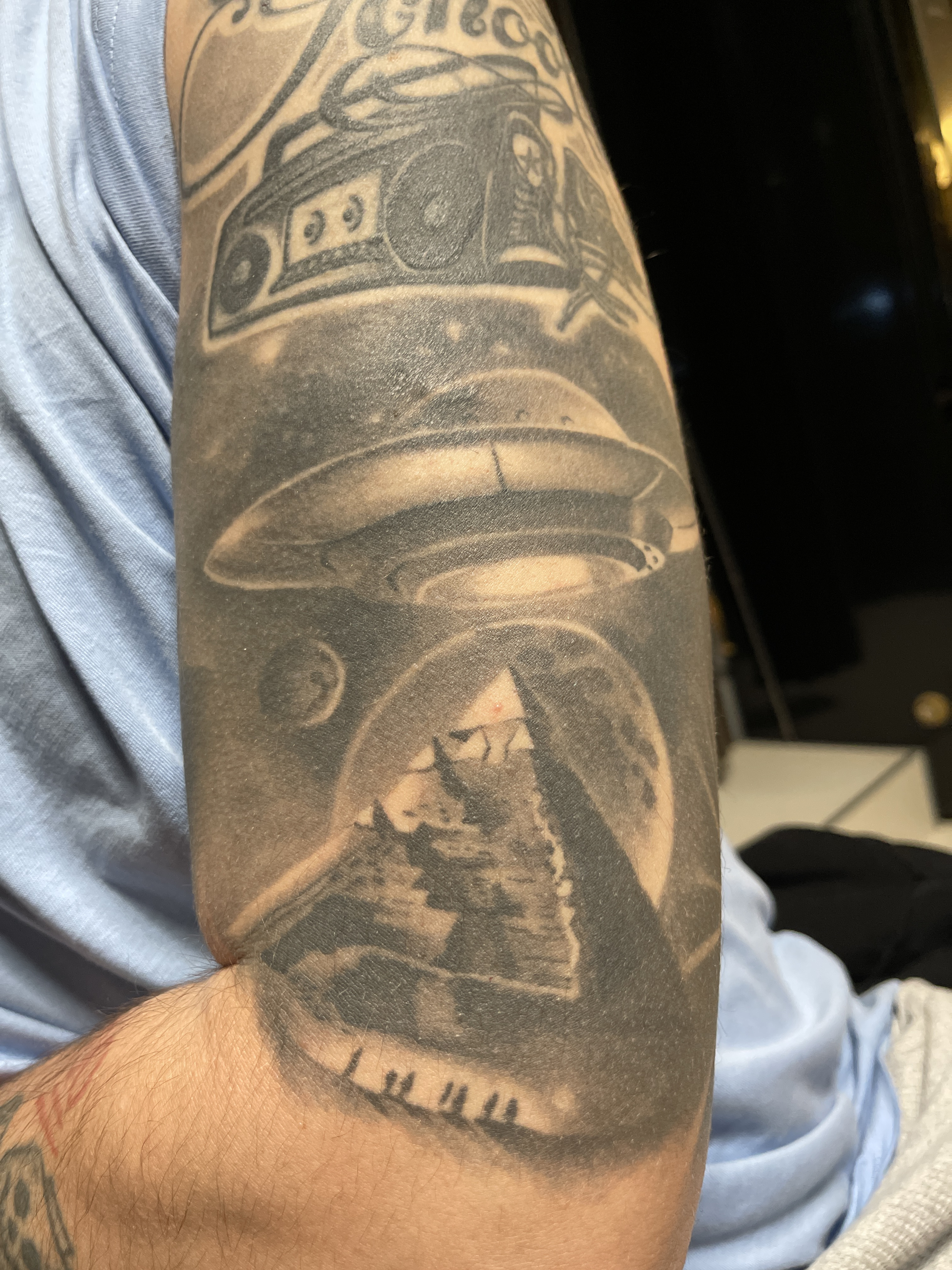
This full sleeve showcases ambitious Asian-inspired imagery executed in a bold blackwork style with dramatic negative space integration. The composition features what appears to be a large dragon or serpent wrapping around the forearm, with its scaled body creating strong visual movement from wrist to elbow. The upper arm displays intricate wave patterns and circular motifs that evoke traditional Japanese irezumi elements. What makes this piece particularly striking is the extensive use of solid black saturation contrasted with skin-toned negative space that defines the primary imagery—this is a technically demanding approach that requires confidence and precision. The wraparound nature creates good flow, and I can see deliberate attempts to follow the arm's musculature. The saturation appears consistent throughout, suggesting either a completed piece or well-healed work, which speaks to both the artist's technical execution and the client's commitment to the lengthy process required for such coverage.
However, there are areas where the execution could be refined. The negative space elements—particularly the dragon/serpent body—show some irregularity in their edges and proportions. The head of the creature (visible on the forearm) appears somewhat flattened or compressed, lacking the dimensional quality that would make it truly leap from the arm. The transition zones between the heavily saturated black areas and the decorative background elements (waves, swirls) could benefit from more sophisticated blending or intentional separation to prevent visual confusion about depth and layering.
# IMPROVEMENT TIPS
- **Refine the creature's anatomy**: The dragon/serpent head could be enhanced with touch-ups that add more definition to facial features, creating clearer distinction between snout, jaw, and eye areas to improve readability and impact
- **Sharpen negative space edges**: Some of the skin-tone areas defining the main imagery show slightly soft or wavy borders—precise cleanup work would dramatically increase the crispness and professional appearance
- **Add strategic highlighting or detail work**: Consider incorporating subtle white ink highlights or fine gray-wash shading within the negative space areas to create more dimension and prevent the design from appearing too flat
- **Improve compositional balance**: The upper arm's decorative elements (waves and circular patterns) could be better integrated with the lower arm's focal imagery through connecting elements or more cohesive scale relationships
- **Address any blowout or aging issues**: Some areas appear to show slight ink spread—a skilled artist could minimize this with strategic coverwork or by redefining boundaries during future sessions
# TREND COMPARISON
This sleeve aligns well with the contemporary resurgence of bold blackwork and negative space tattooing, which has gained significant momentum over the past 5-7 years as artists push away from traditional color-heavy realism. The Asian-inspired aesthetic remains perpetually popular, though current trends favor either hyper-traditional Japanese execution with vibrant colors or ultra-modern geometric interpretations. This piece sits in an interesting middle ground—it attempts traditional imagery but uses modern blackwork techniques. While full blackout sleeves with negative space are definitely "on trend," the most cutting-edge versions typically feature more precise, almost stencil-sharp edges and more intentional geometric or illustrative design work. This piece has that bold visual impact that social media algorithms favor, though the execution would need refinement to compete with the top-tier blackwork specialists currently dominating the scene.
# TECHNICAL NOTES
- **Lighting and photography**: The indoor lighting creates some challenges—there's a slight yellow cast and the flash creates a hot spot on the forearm that makes it difficult to assess the true saturation quality and any subtle gradient work. Natural daylight would better reveal the piece's actual appearance and any healing or texture issues.
- **Composition and framing**: The bunched-up sleeve and casual positioning, while giving an authentic "real life" view, partially obscures the upper portion of the design. A fully extended arm photograph would better demonstrate how the composition flows and whether the placement truly complements the arm's anatomy.
- **Saturation and contrast**: The black appears densely packed and well-saturated overall, which is crucial for this style's longevity. However, some areas show slight patchiness or variations in density that could indicate either healing stages, multiple sessions with different needle configurations, or minor technique inconsistencies that could be addressed with a touch-up pass.
AI opinion for entertainment only
Comments 0
Join the conversation
Log in or create a free account to post a comment.
Sign in
No comments yet — be the first to share your take.