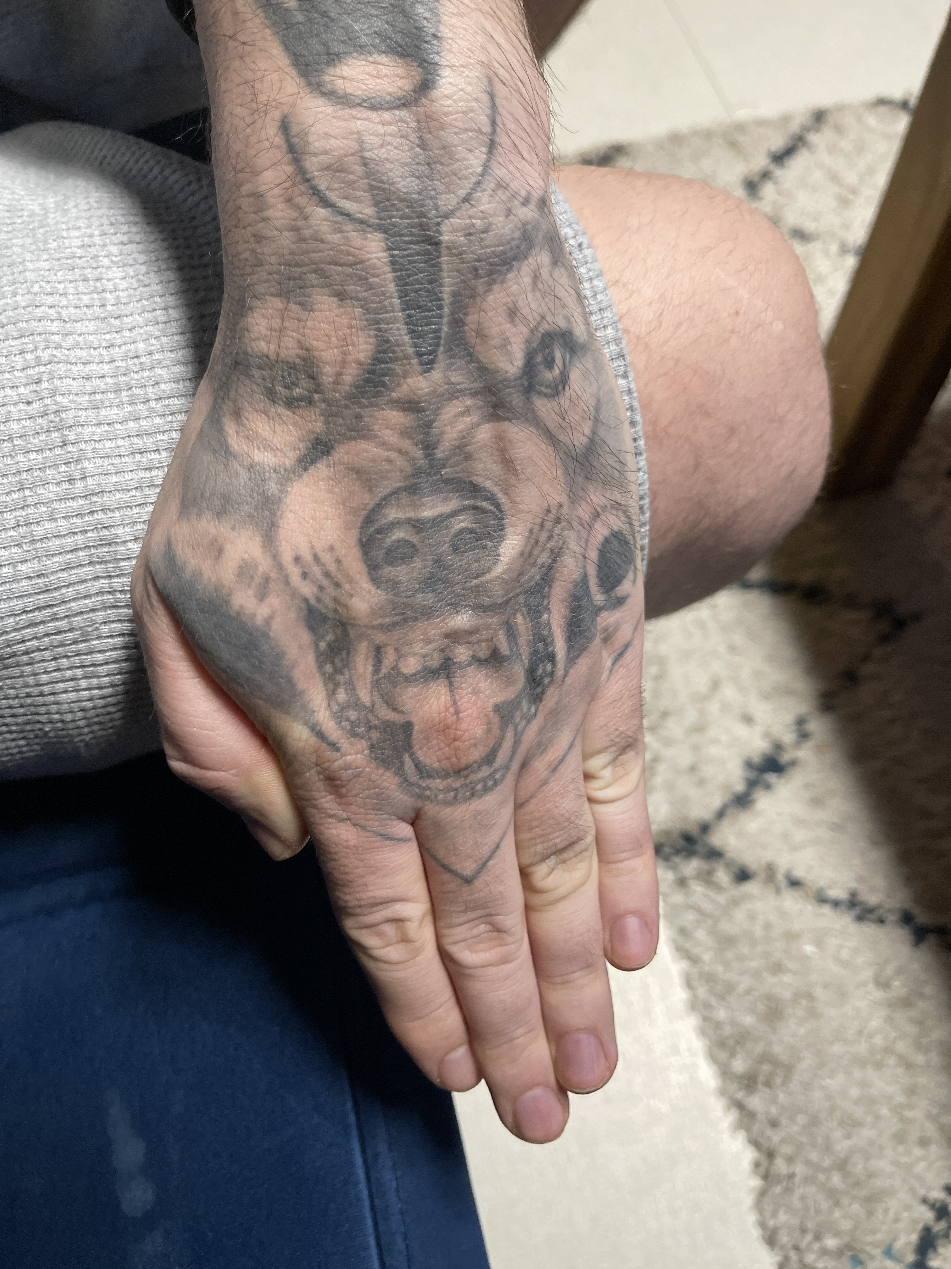
Tattoo
Gigibossu
View profile
2.7
/ 5.0
★★★★★
★★★★★
Bold but Uneven
"Shadowy folklore vibes with raw energy that outpaced the technical finish"
Dark imagery with technical execution issues throughout
Breakdown
-
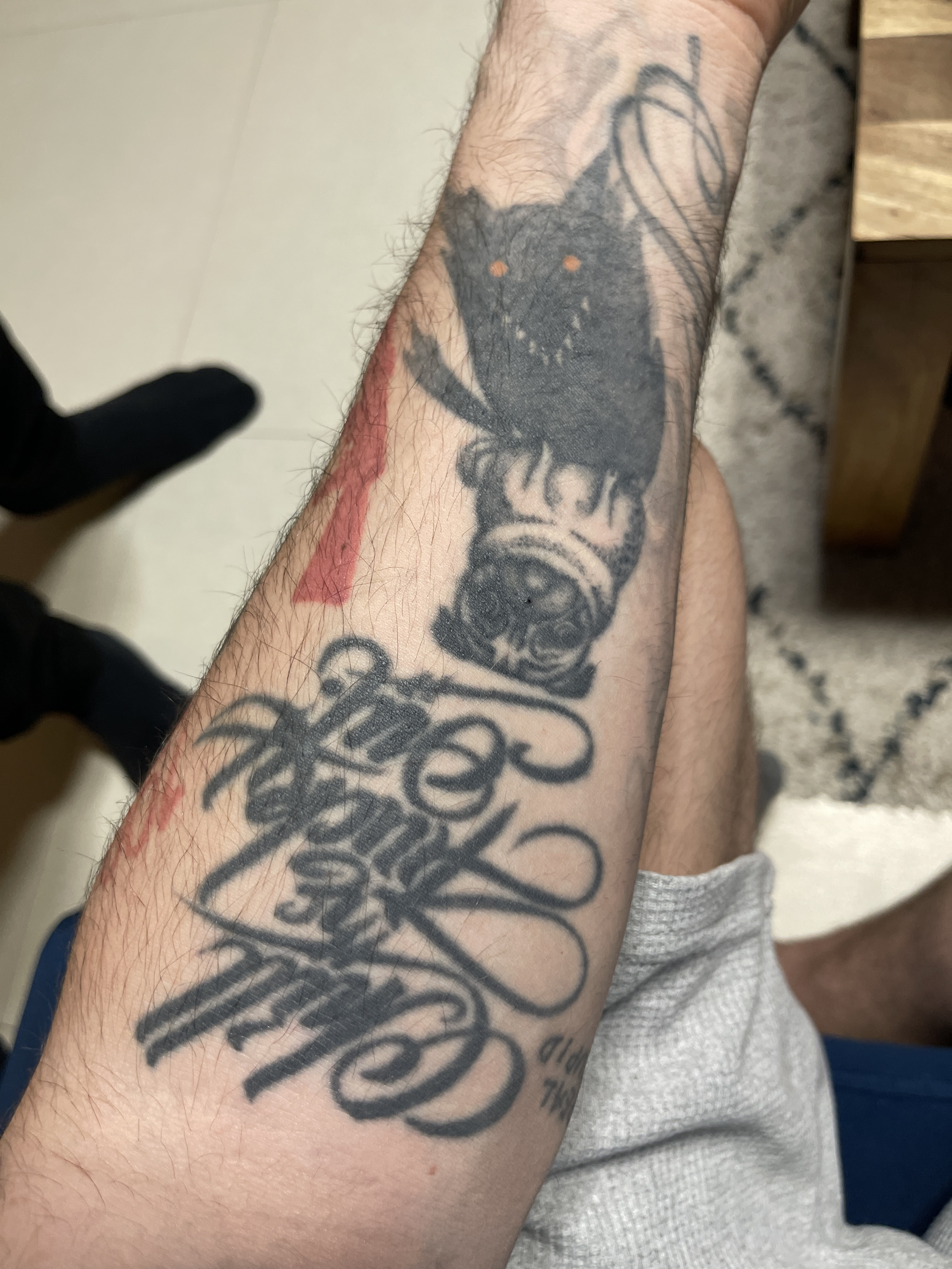
Line Work4/10The script lettering shows wobbly, inconsistent strokes and the creature's outline varies significantly in thickness and steadiness.
-
Shading & Fill5/10Heavy black saturation on the creature appears muddy and blown out, making details like teeth and features hard to distinguish.
-
Design & Creativity6/10The dark creature with orange eyes and ornate script show creative ambition and strong thematic cohesion.
-
Placement6/10Forearm placement works for visibility, though the composition feels slightly cramped on the narrower part of the arm.
-
Execution6/10The red accent stripe is cleanly saturated, but overall technical control shows inconsistency across different elements.
How to push it higher
- 1 Consider laser sessions to lighten the overpacked black areas on the creature so details like teeth and fur texture become visible again
- 2 For future work, request the artist use lighter pressure and build black gradually in layers rather than packing solid black immediately
- 3 The script would benefit from a skilled artist refining those letter forms where lines wobble, particularly in the flourished capitals
Trends
dark-creature
script-lettering
blackwork

Free plan includes watermark
Remove — from $3.99/mo
AI opinion for entertainment only
Comments 0
Join the conversation
Log in or create a free account to post a comment.
Sign in
No comments yet — be the first to share your take.